Rules Engine
The DX Engine comes equipped with a native rules engine that evaluates the Experience Rules configured at a Component Level. The Experience Rules determines the flow of the API Orchestration and plays a crucial role in shaping the experience. Both business and technical teams can use the rules engine, albeit for different use cases.
Experience Rules for Business Teams
Business Teams use Experience Rules to tailor and control the experience at a Component level. They have access to the Experience Rules dashboard and can manage who sees what content when and where.
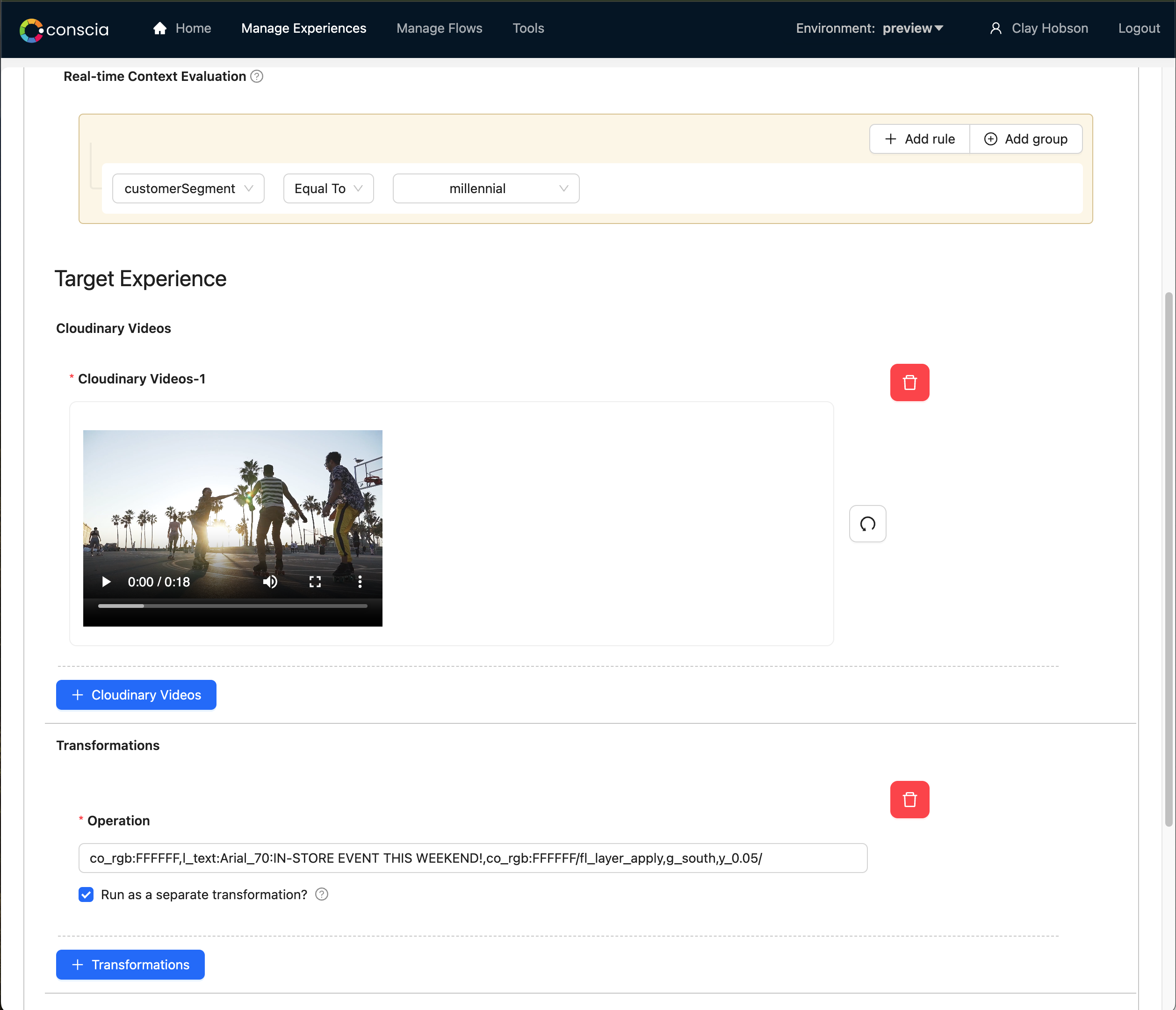
For example, a business user would manage the rules for the hero banner on a Home Page on the web channel. If the content for the hero banner is coming from Cloudinary, the Experience Rules interface will allow them to select a specific asset from Cloudinary. Note that the DX Engine UI allows business users to select the asset via an intuitive workflow that connects directly to Cloudinary APIs. Furthermore, the interface allows you to apply transformations to the asset using the power of Cloudinary's transformation and optimization APIs.
Here is an example:
Experience Rules for Technical Teams
For technical teams, Experience Rules offer a much broader utility. Technical teams are responsible for configuring an orchestration flow that may make API calls to two different systems depending on the Context of the customer. For example, for B2B users, call a CRM, and for B2C customers, call a CDP.
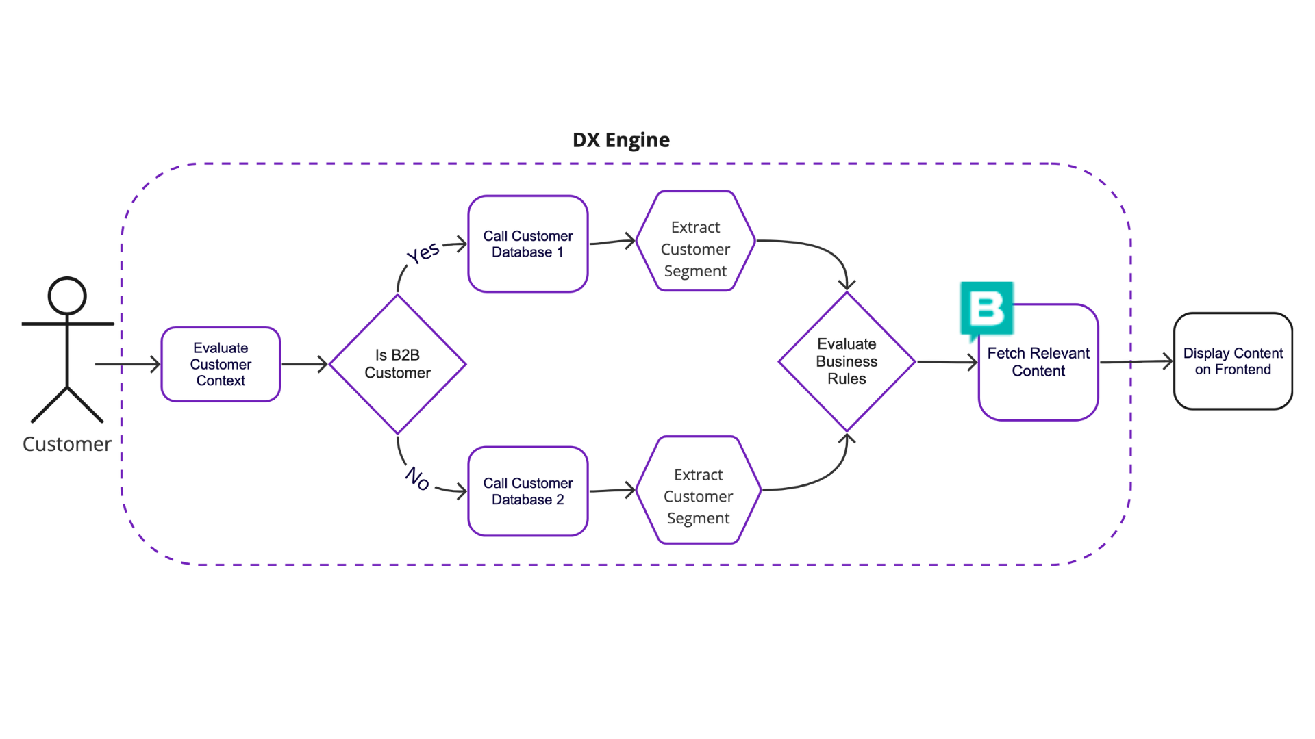
In the same manner, technical teams can utilize the rules engine to implement various IF/Then scenarios that are common in the business logic layer of their tech stacks. These can either be exposed and configured in the UI or can be controlled via the DX Engine API.
The Anatomy of Experience Rules
Each Experience Rule has the following elements that determine how the rule is evaluated and what is returned as the Component response:
- Start/End Date and Time - The rule will only trigger during this time
- Active/Inactive - The rule will not be evaluated if it is inactive
- Access Control Tags - This determines who is able to manage and access the rules
- A/B Test - A rule can be set to do A/B testing between two or more different variants. If this is the case, traffic will be split between the various experiences based on the traffic split set up in the rule.
- Trigger Context - The rule will only fire if the current context meets the trigger criteria.
- Priority - If two rules trigger because they both satisfy the Trigger conditions, the one with the higher priority will win.
- Target Experience - this is a set of parameters populated and returned to the client application. For Static Record List Components, the Target Experiences allows business users to hand select a set of records from the backend data source. For Dynamic Record List, the business user would configure a dynamic criteria based on which records are retrieved from the backend. The records that fit the dyanamic criteria will be returned when the DX Engine executes this rule.
- Configurable Attributes - Sometimes, you want to pass additional instructions to the frontend (or another client application). For example, along with the list of content items that should be displayed, you want to tell it whether they should be displayed in a carousel or a simple list. You can provide business users the ability to configure these design props. Another example could be that you want to pass along the campaign code to the frontend for the purpose of analytics. This can be configured as an 'Attribute'.
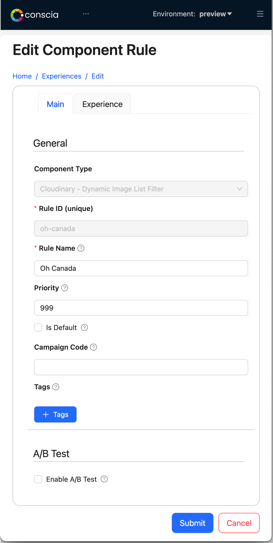
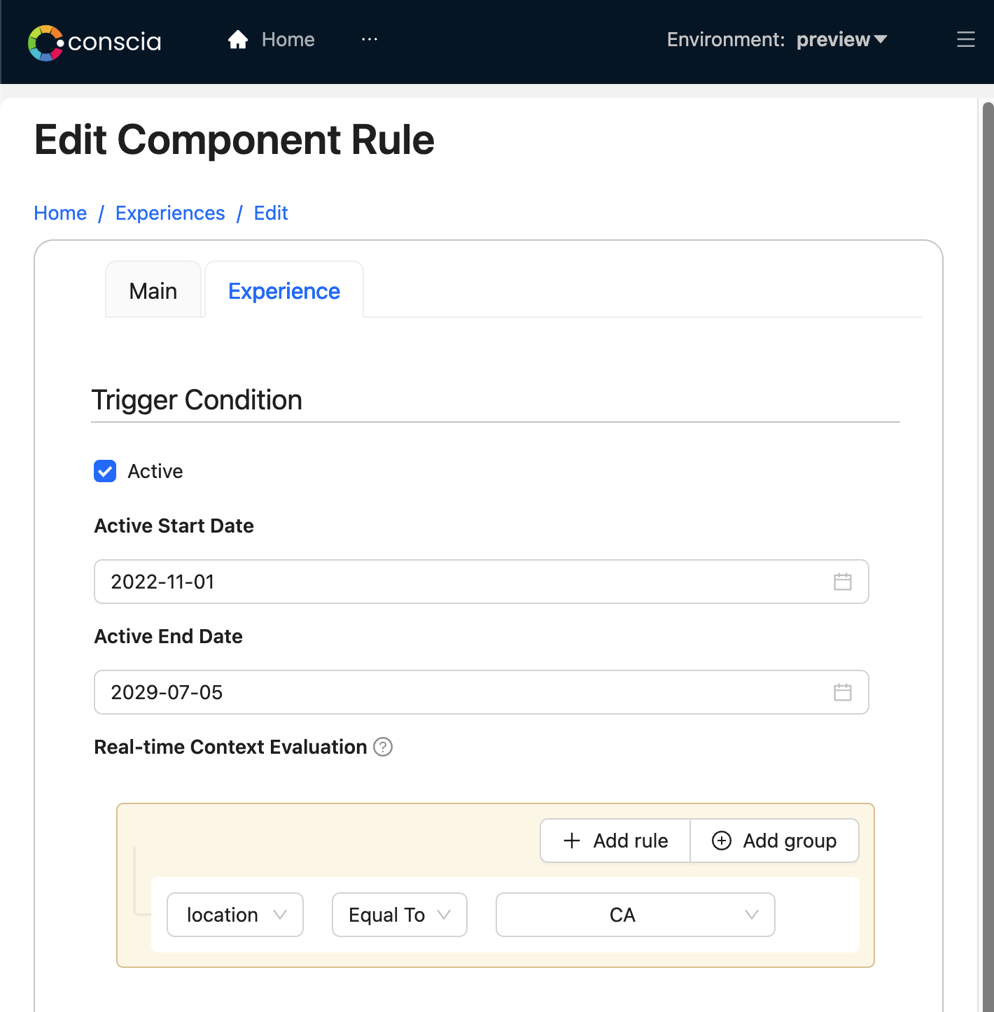
These are the sections that business users would use to configure an Experience Rule: The general definition of the rule, the trigger conditions, and lastly the target experience.
| General Information | Trigger Conditions | Target Experience |
|---|---|---|
 |  |  |
General Information
- Component Type: This is a predefined selection; in this case, it's set to "Cloudinary - Dynamic Image List Filter."
- Rule ID (unique): A unique identifier for the rule, which needs to be filled in by the user. Here, it's "oh-canada," which is a user-defined ID.
- Rule Name: A user-friendly name for the rule; this can be something descriptive that the business users would understand. The example given is "Oh Canada."
- Priority: A numerical value that probably defines the order in which this rule is evaluated against others. Lower numbers may indicate higher priority. The example has "999" which suggests it's a lower priority rule.
- Is Default: A checkbox that, if selected, may set this rule as the fallback or default rule if no other rules are triggered.
- Campaign Code: A field for a code that links the rule to a specific campaign or initiative within the business.
- Tags: These are used for categorization or access control within the system. Users can add multiple tags.
Trigger Conditions
- Active: A checkbox that indicates if the rule is currently in use.
- Active Start Date and Active End Date: These fields specify the time frame during which the rule is active. In the example, the start date is "11/01/2022 12:00 AM" and the end date is "12/31/2023 12:00 AM."
- Real-time Context Evaluation: A field where users define criteria for when the rule should be triggered. In the example, it is set to trigger when "location is equal to (=) CA," which suggests that the rule applies when the location is Canada.
Target Experience
This section will have a different set of configurable fields depending on the type of Component. For example, if the Component is for a CMS and you would like the business users to manually select a list of content items from a specific content type, this would be very different than if you want to connect to a Digital Asset Management system and allow them to pick a dynamic list of assets based on tags.
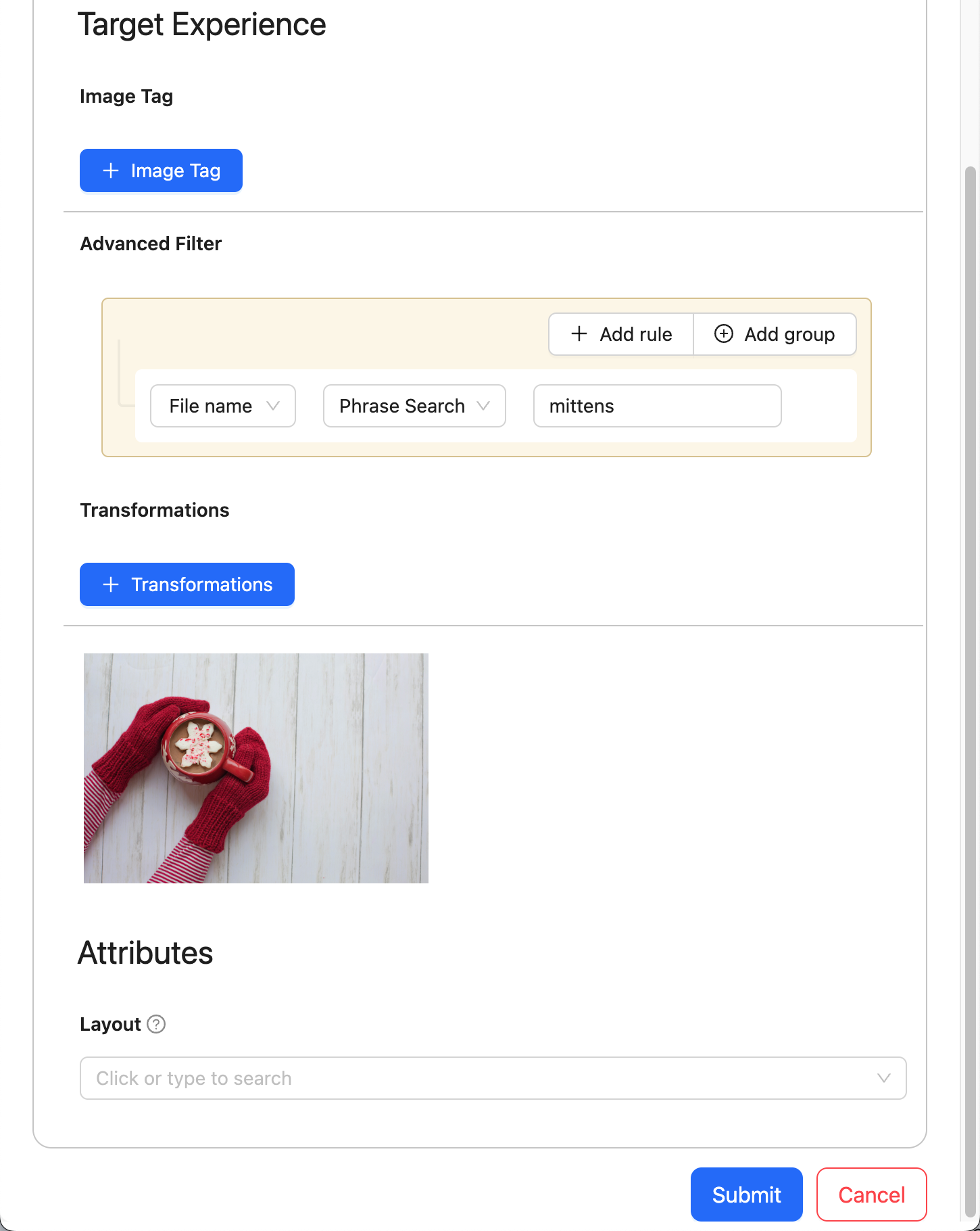
In the example above, we are configuring an Experience Rule for Cloudinary, which is a Digital Asset Management system. Here are the fields that you would configure:
- Image Tag: A field where users can add tags that are associated with images that the rule should apply to.
- Advanced Filter: A field for specifying advanced filtering options. In the example, it's set to filter images where "File name contains the phrase 'mittens'."
- Transformations: Users can add transformations that should be applied to the images. This could involve resizing, cropping, or applying other visual effects.
- Attributes: These are additional instructions that control the presentation of content. For instance, "Layout" is mentioned with options to select how a banner is styled horizontally.
There are two types of fields that can be configured within the Target Experience:
-
Parameters : These are inputs to the backend API that are used to query the system. The list of parameters that are available to be edited by business users depends on what you would like them to manage as well as what is available to be controlled in the vendor's API. Cloudinary, for instance, allows you to retrieve images by searching for them, filtering based on a set of tags and even apply a transformation to them. Therefore, in the above example, Image Tag, Advanced Filter and Transformations are 'Parameters'.
-
Attributes : These are additional instructions that you want to send to the frontend that could be used for the purpose of presenting the experience in a certain way, or perhaps used for analytics purposes.
A Component that requires business user input needs to expose a set of parameters available within the API endpoint. This is accomplished by doing the following:
- Study and analyse the API docs of the vendor API endpoints
- Determine which parameters would make sense to expose to business users to configure
- Create a mapping between the parameters available within API endpoints and the UI behaviour you want to achieve using a JSON file that describes the Component configuration interface.
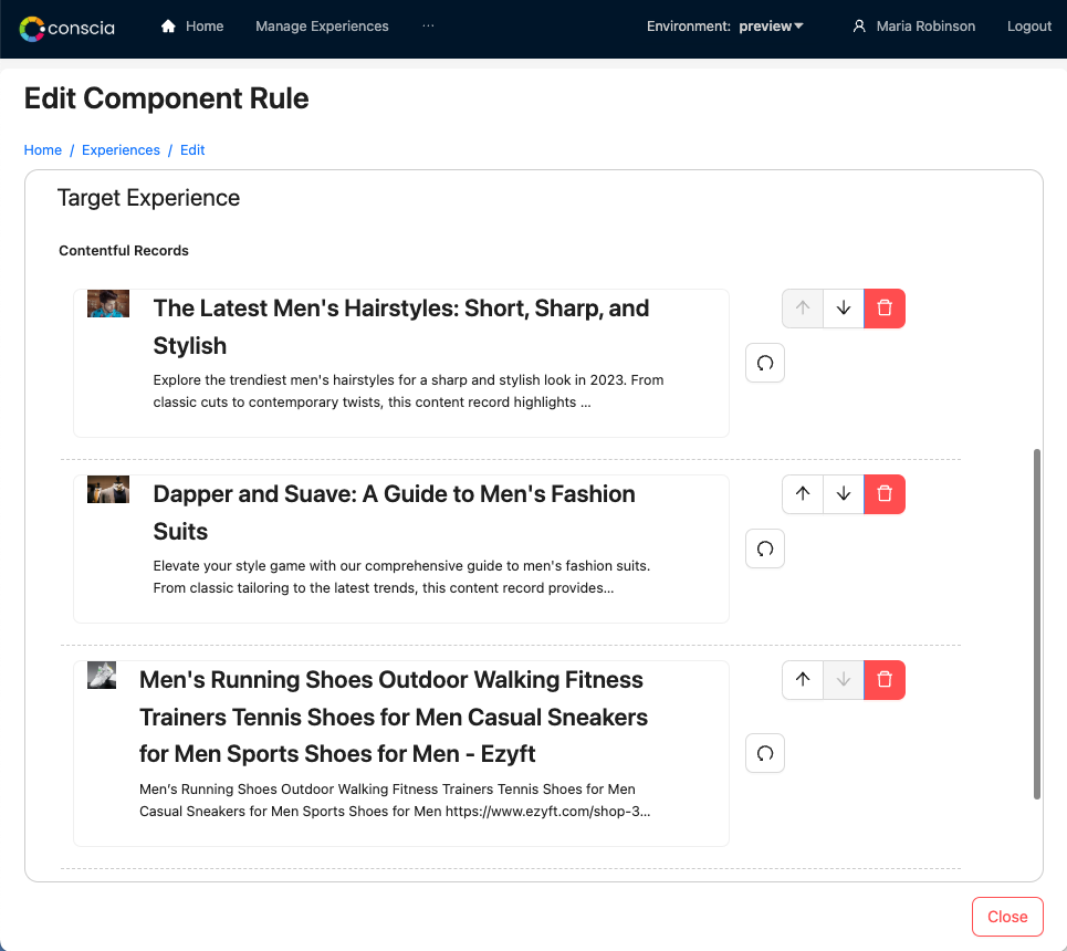
When records are displayed as part of an Experience Rule (or as part of a data grid in DX Graph), the look and feel of each record is controlled by the "display template". The display template is a snippet of HTML code that can contain elements of data combined with visual styling to make the record listing more visually friendly to the business user.
In the example below, the display template is defined to show elements of the record including the image, name and description.
Display Templates
Developers define a Display Template on a given Component that will determine the user experience for Experience Rule configuration. In an HTML snippet, they lay out which elements of the record entry will display and apply styling.
Display Template configuration is only available on vendor-specific Component Types.
Defining a Display Template
For 'Static' Components, you can configure a 'Display Template' to control the business user's editing experience. Here is how it's done:
- Navigate to the Components dashboard.
- Find the experience Component of interest.
- Click the Edit button.
- Under the "Options" portion of the Component, find the "Display Template" section.
- Click on the code view("< >") button to bring up the HTML editor.
- Define the display template. Here, you can include HTML as well as attributes of the record using the
{{myAttribute}}syntax. - Once done, click the code view button again to visualize the record look and feel.
- Save the Component
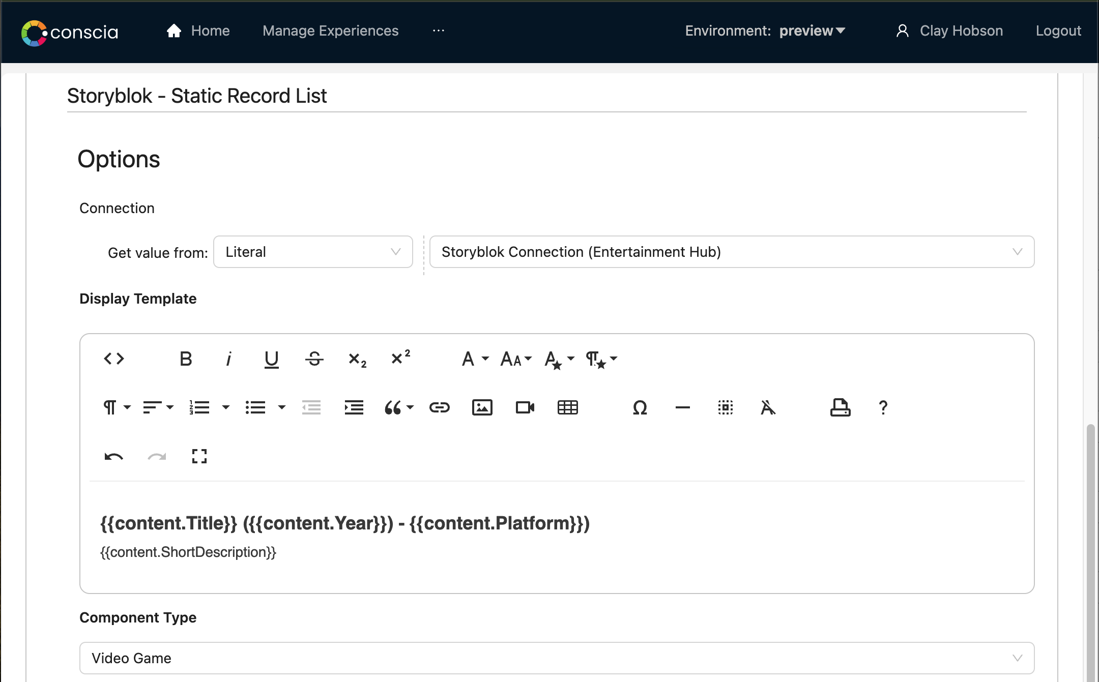
In the example above, title, description and other attributes are defined as part of the display template. The actual name of the attribute will vary based on your collections schema mode. In most cases, the field code of the attribute can be used. If your target field is a nested field in the schema, simply define the path like in the example above.
Once the display template has been defined and saved, navigate back to the corresponding experience rule to see the updated look and feel of the records.
Sample Display Template
The following display template HTML generates the layout seen in the record list above with an image to the left and name and description to the right.
<div style="display:inline;text-align:left;">
   <div style="display:inline;text-align:left;margin-right:20px;"><img src="{{Image_URL}}" height="75px" class="fr-fic fr-dii"></div>
   <div style="vertical-align:top;display:inline-block;">
      <div style="font-weight:600;font-size:1.5rem;margin-bottom:10px;">{{Name}}</div>
      <div style="font-weight:400;font-size:1.2rem;margin-bottom:10px;">{{Header}}</div>
   </div>
</div>
A/B Testing and Personalization
A/B testing in the DX Engine is integrated directly into Experience Rules. Here is how it works:
- Experience Rules & Triggers
All components in the engine allow for Experience Rules. These rules act as conditional configurations that override the default component settings when a specific context is met. (e.g., price > 100).
- Multiple Configurations
When A/B testing is enabled for a component, an experience rule can contain multiple configurations instead of just one. Each configuration represents a different "variant" of that Component's behavior or data.
- Variant ID and Weighting
Each variant is defined by two key properties:
- Variant ID: A unique identifier for the specific configuration.
- Weight: A relative number that determines the probability of that variant being selected. For example, if Variant A has a weight of 70 and Variant B has a weight of 30, Variant A will be chosen approximately 70% of the time.
- Selection Logic
When a rule's trigger condition evaluates to true, the DX Engine uses the relative weights to randomly select one of the available configurations for execution.
- Stickiness
The engine supports Stickiness. The engine will remember which Variant ID was chosen for a specific visitor or session. This ensures that the user consistently sees the same experience in future requests, preventing jarring changes during their session or across multiple visits. If Stickiness has been set to visitor, the visitor identifier must be a string that is passed within the Context as @visitor. Otherwise, if Stickiness has been set to seccion, the session identifier must be a string that is passed within the Context as @session.