Orchestration Components
A Component is an atomic processing unit that processes data and business logic based on the Component's configuration. Components can carry out read and write tasks, as well as decisioning, transforming, merging, and caching data.
Here are the main features of a DX Component:
- May or may not use a Connection
- Can retrieve data directly from the backend system via the Connection or from other Orchestration Components
- Can write data to another system
- Can be passed a real-time Context, which may be received from the client application or set by one of the other Orchestration Components
- May or may not process business rules to drive aspects of the business logic based on the Context passed to it
- Can cache its response to avoid unnecessarily calling backend APIs or process information that has already been processed
- Can manipulate and transform data received from various inputs
- Can be chained with other Orchestration Components
Orchestration Components are NOT the same as UI Components. They may provide the data that can be consumed by the UI Component, but do not provide any HTML/CSS or any other framework specific code/markup.
Creating a Component
- Navigate to Manage Experiences > Experience Component.
- Click the “+ Add Component” button to create a new Component.
- In the form modal, enter the following information:
- Component Code: This is a unique name for the Component.
- Component Name: A friendly name for the Component.
- Component Description: A description of what the Component does
- Logo: The URL to a logo to be associated with the Component (will default if left empty).
- Is Asynchronous: If checked, this Component will be executed asynchronously and the DX Engine response will not wait for it to complete. If this Component is depended upon by any synchronous Component, this Component will be executed synchronously.
- No Rules: Check this box if Component will have no Experience Rules associated with it.
- In the Component Type field, select the type of Component you want to create.
- Click Submit.

After you have saved this initial set up, the new Component will be added to the Component listing. Click the Component's Edit button to complete configuration.
Component Naming Conventions
Since Components make an API call which perform a CRUD operation, it is good to have a descriptive name - <Action performed> <Resource/noun> <SaaS used(optional)>. For example:
Get Cart IDGet Hero Banner - CloudinaryRemove Items from Cart
If you use any mapper, data transformation script, or metadata Components, you can prefix the Component with Model, Mapper, Metadata, Transform, etc to give a clear indication that this Component performs data manipulation. For example:
Mapper - Hero Banner - CloudinaryModel - Featured Products
Component Configurations
All Orchestration Components have some sort of configuration that controls the Component's behaviour. Some behaviours include:
- Select the content type in which to fetch specific content records
- Determine the search index to query
- Choose a promotion to offer
- Specify a value to transform
- Select a collection to write to
- Provide a list of products to remove from inventory
- Determine whether the Component should do anything at all
To Configure a Component:
- Find the Component in the listing.
- Click on Component's Edit button.
Many configurations can use values that are determined at query-time via Expressions.
There are three different methods of specifying configuration values:
| Method | Description |
|---|---|
| Literal | A hardcoded configuration value is specified within the Component at setup-time. |
| Context Field | The configuration value is determined at query-time by using the value from the specified Context Field. |
| JS Expression | The configuration value is determined at query-time by evaluating an expression (which has access to all Context Fields and Component results) |
There are a common set of configurations that all DX Engine Components have. Depending on the type of Component, there are configurations that are specific to a Component.
Common Configurations
| Name | API Property | Uses Expressions | Description |
|---|---|---|---|
| Context Field Enrichments | contextFieldEnrichment | Yes | Uses the Component's response to calculate values to be put into the Context for other Orchestration Components to reference. See details here. |
| Sub Components | subComponents | Yes | Provides a way to enrich each record in a Component's response with the results of other Component executions using custom Contexts. See details here. |
| Cached | cacheConfig.cached | No | If set to true, the responses of this Component will be cached. The default value is false. |
| Cache Time-to-live | cacheConfig.cacheTtl | No | The number of seconds that cached responses will be cached. |
| Cache Tag Configuration | cacheConfig.cacheTags | No | A list of tags that will be associated with the cached response. See details here |
| Trigger Expression | trigger | Yes | The default value is true. |
| Validity Expression | validity | Yes | The default value is true. |
| Skip on Failed Dependency | skipOnFailedDependency | No | The Component's execution is skipped if any of the Components on which it depends, is in a FAILED state. |
| Skip on Skipped Dependency | skipOnSkippedDependency | No | The Component's execution is skipped if any of the Components on which it depends, is in a SKIPPED state. |
| Skip on Invalid Dependency | skipOnInvalidDependency | No | The Component's execution is skipped if any of the Components on which it depends, is in an INVALID state. |
| Metadata | metadata | No | Key/value pairs with additional metadata to include on this Component. |
| Response Transform | responseTransform | Yes | Modifies (or completely overwrites) the Component's response. |
The API Property is the corresponding property to update via the Management API.
Component-Specific Configuration
Component-specific configurations are dependent upon the specific Component Type. The available configurations for each Component are documented on that Component's documentation page.
See Component Types for more information.
Expressions
Expressions allow for query-time evaluation of values using JavaScript syntax. Example: response.customerSegment and componentResponse('myComponent').
Depending on where an expression is used, it has access to different set of variables/functions.
All expressions have access to the following Javascript variables/functions:
| Variable/Function | Description |
|---|---|
| _ | Lodash utility |
| encodeURI | Native Javascript function |
| encodeURIComponent | Native Javascript function |
| JSON | Native Javascript Object |
| Array | Native Javascript Object |
| Promise | Native Javascript Object |
| Object | Native Javascript Object |
| DateTime | Date and Time manipulation utility from the luxon library |
For more detail see Helpers in JS Expressions.
Functions used to retrieve Component and Context data
The following functions can be used to access Context Fields and Component responses, status, and extras.
| Variable/Function | Description | Example |
|---|---|---|
| contextField(contextField) | Pass a value from the Context Field as a Query Parameter. | contextField('categoryID') |
| componentResponse(componentCode) | Pass a value from an upstream Component response as a Query Parameter | _.castArray(componentResponse('fetchProductIDs').productIDs) |
| componentStatus(componentCode) | Check to see if an upstream Component was processed successfully | componentStatus('fetchProductIDs') |
| componentExtras(componentCode) | Pass data from upstream Component found in the Extras section, such as metadata or triggered Rule information. | componentExtras('example-component').metadata.filter(entry => entry.key === '__typename') |
Expressions used for Triggers
These expressions are evaluated to determine whether the current Component should be processed. The expression is expected to return a boolean value (true or false). However, if it returns a non-boolean value, the DX Engine will determine the Component's processing based on the 'truthiness' or 'falsiness' of that value. In JavaScript, certain values are inherently falsy (e.g., false, 0, "" (empty string), null, undefined, NaN), while all other values are considered truthy. This behavior allows for flexible expression evaluations in determining the processing logic of the Component.
| Variable/Function | Description | Example |
|---|---|---|
| contextField(contextField) | Fetch the value of the Context Field by Name | contextField('location')==='US' |
| componentResponse(componentCode) | Fetch the response of an upstream Component | _.castArray(componentResponse('fetchProductIDs').productIDs).length > 0 |
| componentStatus(componentCode) | Check the status of an upstream Component | componentStatus('callCustomerDatabase')==='VALID' |
Expressions used for Validity
These expressions check for the Validity of the response of the Component currently being processed. The expression is expected to return a boolean value (true or false). However, if it returns a non-boolean value, the DX Engine will determine the response validity on the 'truthiness' or 'falsiness' of the resulting value. In JavaScript, certain values are inherently falsy (e.g., false, 0, "" (empty string), null, undefined, NaN), while all other values are considered truthy.
| Variable/Function |
|---|
| response |
| contextField(contextField) |
| componentResponse(componentCode) |
| componentStatus(componentCode) |
Expressions used for Context Field Enrichments
Context Fields are available to all Components that are to be processed within the scope of a single Experience API call. Each Component has the ability to update the Context of the query and all downstream Components will always read the most up to date value of the Context.
| Variable/Function | Description | Example |
|---|---|---|
| response | Response of the current Component being processed | response.customerSegment |
| contextField(contextField) | Fetch the value of the Context Field by Name | contextField('categoryID') |
Expressions used for Sub Components
| Variable/Function |
|---|
| response |
Expressions used for Response Transform
| Variable/Function |
|---|
| response |
Component X becomes dependent upon Component Y when Component X uses any expression (anywhere within Component X's configurations) that contains:
- Uses
contextField('someContextField')wheresomeContextFieldis enriched by Component Y's Component Field Enrichments - Uses
componentResponse('componentB') - Uses
componentStatus('componentB') - Uses
componentExtras('componentB')
Component Statuses
When a query is made to the DX Engine Experience API, all of the requested Components are processed. The following flowchart describes the various states that a Component goes through.
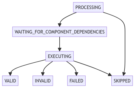
| State | Description |
|---|---|
| PROCESSING | A request to the DX Engine has occurred and this Component is part of fulfilling the reponse. Uses the Trigger expression to determine if it should run. If so, the Component is executed (enters the EXECUTING state). Otherwise, this Component will not be executed (enters SKIPPED state). |
| WAITING_FOR_COMPONENT_DEPENDENCIES | Waits for any Orchestration Components on which it depends to be complete (either of the following states: VALID, FAILED, SKIPPED). Afterwards, the engine determines if the Component should be skipped. It will be skipped if any of the Skip on xxx Dependency (see this) checks are satisfied. Otherwise, the Component is executed (enters the EXECUTING state) |
| EXECUTING | The Component logic is run. If any failure occurs during the execution, it enters FAILED state. Otherwise, the Component enters VALID state. If a Validity expression was specified, it is evaluated. If it evaluates to false, the state moves to INVALID. |
| SKIPPED | The Component was not executed. |
| VALID | The Component's response is valid. |
| INVALID | The Component's response is not valid. |
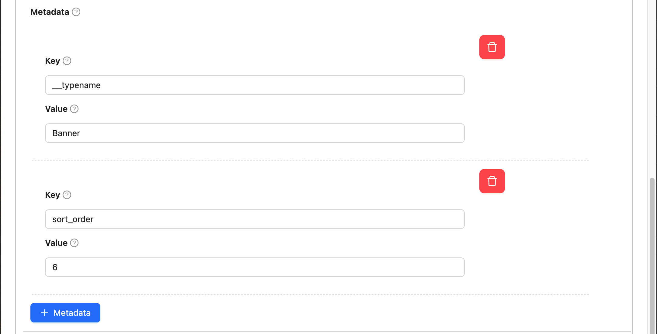
Component Metadata
Metadata are key/value pairs that you define on Components. The metadata values are not part of the main Component response, but rather found in the Component @extras section where triggered Experience Rule data also lives.
{
  "example-component": {
    "@extras": {
      "rule": {
        "metadata": [],
        "attributes": {}
      },
      "metadata": [
        {
          "key": "__typename",
          "value": "Banner"
        },
        {
          "key": "sort_order",
          "value": "6"
        }
      ]
    },
    "status": "VALID",
    "response": {}
  }
}
You can access a Component's metadata using the following expressions:
._get(componentExtras('example-component'), 'metadata')componentExtras('example-component').metadatacomponentExtras('example-component').metadata.filter(entry => entry.key === '__typename')