Component Level Attributes
The DX Engine gives business users the ability to define what content should be seen by who, when and where. However, sometimes, you want to pass additional information to the calling application beyond the content or data fetched from external systems. Also, you want these options to be presented to the business user in an intuitive visual editor.
Using DX Component Attributes as Front-end Design Props
To empower digital teams to pass along additional information and directions to the frontend, the DX Engine offers DX Component Level Attributes. One of the use cases for DX Component Level Attributes is Design Props that the frontend could use to render itself. An example of this would be how you want the layout to be adjusted based on the context of the user. Or, it could be the styling that should be applied to the visual DX Component.
As an example, we have a DX Component that returns the hero banner. A business user may want to control the presentation and decide whether to show a full width banner or a split where one side is the banner and the other side is the title, subtitle, call to action, etc. This can be configured as an 'Attribute' which would be included in the DX Component response as additional instructions for the frontend so that it can change it's presentation or behaviour. In this example, we'll call our attribute "layout" and setup the option for the user to select between "full width" and "split".
Setting Up DX Component Attributes

- Navigate to the Components dashboard
- Select the DX Component of interest (in our case a hero banner Component)
- In the tab selector (top right), select the "Attribute Definition" tab
- Create a new attribute by clicking on the "Add another item" button
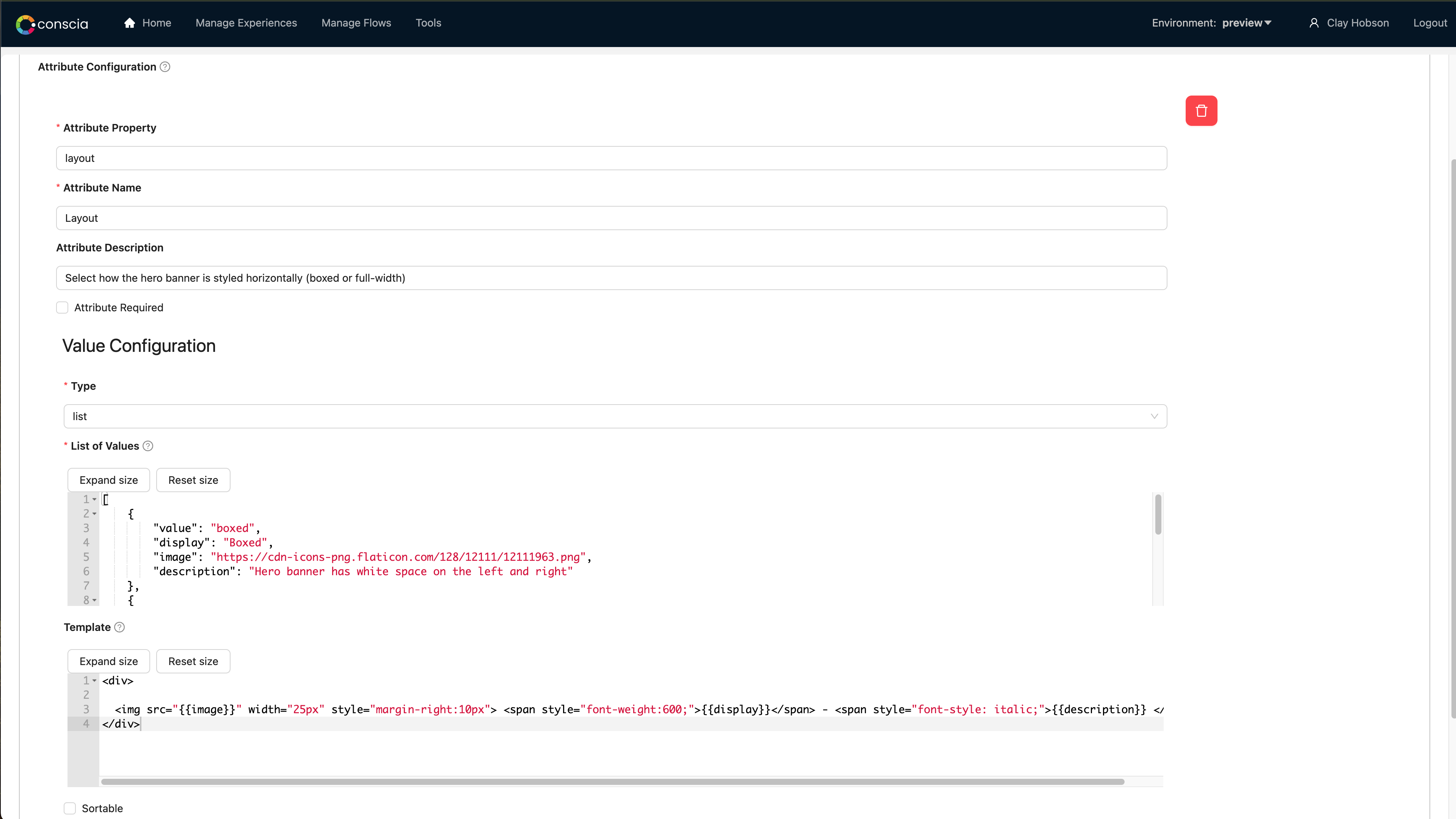
- For the attribute, give it a property, name and description. In our case, ours will be called "layout"
- Under the configuration, select "List"
- In the List of Values area, this is where you can define the options the user will be able to select from as well as the properties of each option. We'll define an option for
boxed,fullwidthandsplit(side by side). For each, we'll give it a display name, image and description. These will be used in the next step. - In the Template part of the configuration, we can define how the defined options will show up visually. Here we'll define an HTML snippet that shows an image and name for each option.
- Save the DX Component
Selecting an Attribute Option
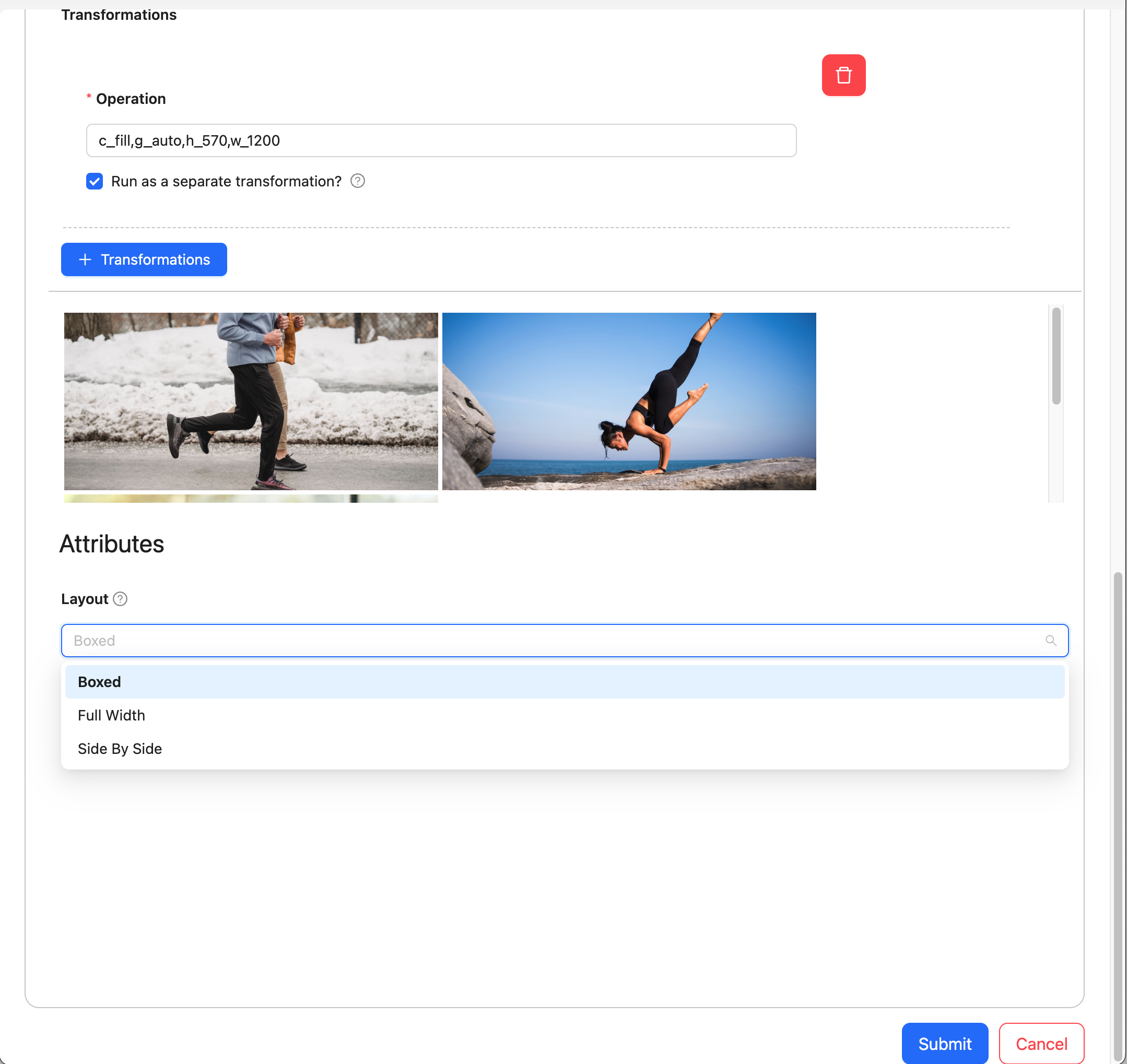
Once the attribute definition(s) are setup, they automatically appear in the Experience Rule as part of the target experience section. Here you can see the options we setup.

Using the Attributes
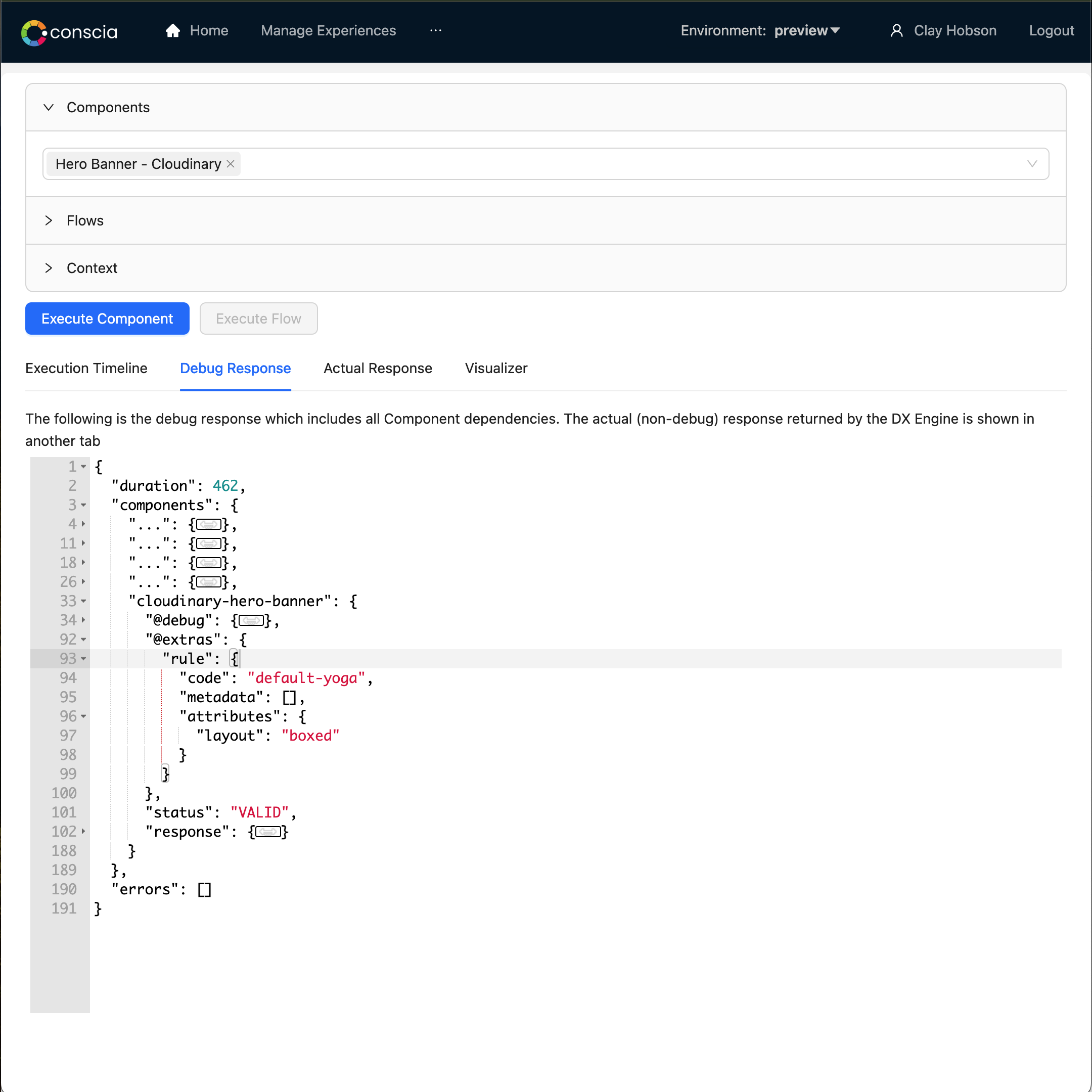
In the DX Component response, attributes are returned as part of the @extras section. This can be used by the front-end to drive additional behaviour related to the attribute.

Types of Attributes
In order to provide user friendly editor experience for non-technical users, the DX Engine offers several types of Attributes:
| Name | Description |
|---|---|
| Text | Prompts the user to enter some text value. There is formatting for: JavaScript, JSON, Handlebars, Markdown, HTML |
| Number | Prompts the user to enter a numeric value. |
| Checkbox | Prompts the user to check or uncheck a checkbox. This satisfies Yes/No; On/Off |
| Manual Picklist | Prompts the user to pick a value from a dropdown. The available values are manually-provided during the configuration of a DX Component. |
| Component Response Picklist | Prompts the user to pick a value from a dropdown. The available values are dynamically fetched from some other source using another DX Component. This allows you to fetch values, for example, another webservice or a delimited file from an S3 bucket. |
| Manual List | Prompts the user to re-order a list of values. The available values are manually-provided during the configuration of a DX Component |
| Component Response List | Prompts the user to re-order a list of values. The available values are dynamically fetched from some other source using another DX Component. |
Common Component Attribute Configurations
Each Attribute has the following common configurations:
| Name | Property | Description |
|---|---|---|
| Attribute Property | attributeProperty | The name of the property in the DX Component's JSON response that will store the value of the Attribute. |
| Attribute Name | attributeName | The display name of the Attribute when displayed to the business user. |
| Attribute Description | attributeDescription | The description of the Attribute when displayed to the business user. |
| Attribute Required | attributeRequired | Whether the Attribute is required or optional. |
| Attribute Type | valueConfig.type | How the value of the Attribute should be collected from the business user. |
Component Attribute Configurations based on Attribute Type
Depending on the Attribute Type, the Attribute may have additional configurations.
| Name | Property | Description |
|---|---|---|
| Default Text Value | defaultTextValue | The default value of the Attribute when the business user is setting up rules for a Component. This is only valid when Value Type is Text. |
| Default Number Value | defaultNumberValue | The default value of the Attribute when the business user is setting up rules for a Component. This is only valid when Value Type is Number. |
| Default Checkbox Value | defaultCheckboxValue | The default value of the Attribute when the business user is setting up rules for a Component. This is only valid when Value Type is Checkbox. |
| List of Values | valueConfig.list | A hardcoded list of available values for the Attribute. The specified value is a JSON array of objects where each object must have a property called value. The value property is used to store the value of the Attribute. Each object may any other number of properties. These properties are used to display the available values to the business user in the UI using a Display Template. This is only valid when Value Type is Manual Pick List or Manual List. |
| Component Code | valueConfig.componentCode | The code of the DX Component that will be used to retrieve the available values for the Attribute. This is only valid when Value Type is Component Response Pick List or Component Response List. |
| Display Template | valueConfig.displayTemplate | A Handlebars HTML template used to display the available values to the business user in the UI. This is only valid when Value Type is Manual Pick List, Manual List, Component Response Pick List or Component Response List. |
When hardcoding a list of available values for a DX Component Attribute (i.e. Value Type is Manual Pick List or Manual List), the specified value is a JSON array of objects where each object must have a property called value. The value property is used to store the value of the DX Attribute. Each object may any other number of properties. These properties are used to display the available values to the business user in the UI using a Display Template. The Display Template is specified as a Handlebars HTML template.
When retrieving a list of available values for a Attribute from another DX Component (i.e. Value Type is Component Response Pick List or Component Response List), the DX Component Code of the DX Component that will be used to retrieve the available values must be specified. The result of the Component must be in the format desribed in List of Values. The Display Template is specified as a Handlebars HTML template.
Example of List of Values
[
  {
    "value": "layout01",
    "name": "Layout One",
    "logoUrl": "https://images.com/layout-01.png"
  },
  {
    "value": "layout02",
    "name": "Layout Two",
    "logoUrl": "https://images.com/layout-02.png"
  },
  {
    "value": "layout03",
    "name": "Layout Three",
    "logoUrl": "https://images.com/layout-03.png"
  },
  {
    "value": "layout04",
    "name": "Layout Four",
    "logoUrl": "https://images.com/layout-04.png"
  }
]
The DX Engine Response
The Attributes show up in the DX Engine Component response in the @extras section as follows:
      "@extras": {
        "rule": {
          "code": "2023-october",
          "metadata": [],
          "attributes": {
            "layout": "sidebyside"
          }
        }
      }
Attributes, just like the rest of the Component response, can be accessed by downstream Components by JS Experessions as well. Here is an example:
_.get(componentExtras('{Component Code}'), 'rule.attributes.{Attribute Property}')