Components
A Component is an atomic processing unit that processes data and business logic based on the Component's configuration. Components can carry out task such as fetching information from a composable system like a CMS or fetch customer context information from a CDP.
Here are the main features of Component:
- may or may not use a Connection
- can retrieve data directly from the backend system via the Connection or from other Components
- can be passed a real-time Context, which may be received from the client application or set by one of the other Components
- may or may not process business rules to drive aspects of the business logic based on the Context passed to it
- can cache it's response to avoid unnecessarily calling backend APIs or process information that has already been processed
- can manipulate and transform data received from various inputs
- can be chained with other Components
Types of Components
Components in Conscia serve as essential building blocks for content experiences. They enable you to define the parameters and criteria for fetching data from different sources. There are two main types of components: Static and Dynamic.

Static Components
Static components in Conscia allow you to hand-select specific records from a system. These components are particularly useful when you know exactly which records you want to retrieve and do not require complex filtering or dynamic criteria. With static components, you specify the records you need directly, and Conscia will return those records as part of the Component response.
Dynamic Components
Dynamic components, on the other hand, allow you to define criteria for content experiences. Instead of specifying individual records, you set conditions or filters that records must meet to be included in the Component response. Dynamic components are ideal when you want to retrieve content based on specific criteria, such as date ranges, product categories, or other attributes.
Creating a Component
- Navigate to Manage Experiences > Experience Component.
- In the dashboard, select the “+” button to create a new Component.
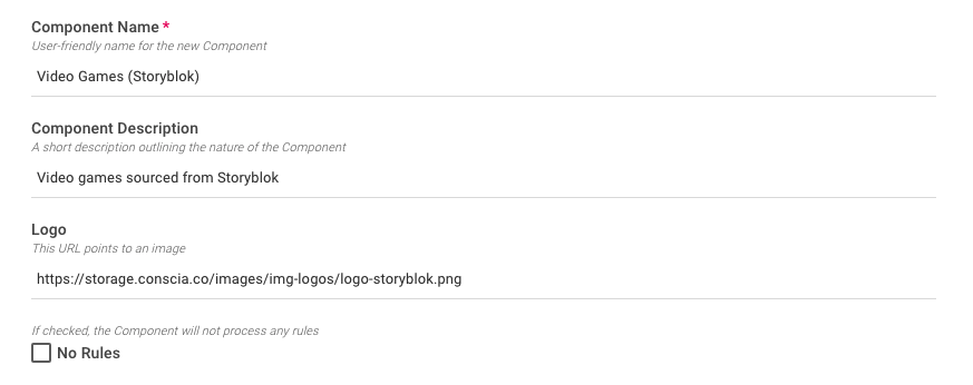
- In the form modal, enter the following segment information:
- Component Code: This is a unique name for the component
- Component Name: A friendly name for the component
- Component Description: A description of what the Component does
- Logo: The URL to a logo to be associated with the component
- No Rules: Check this box if Component will have no experience rules associated with it

- In the Components Type field, type and select system this Component should connect to and it's behaviour (i.e. static or dynamic component)
- Hit Submit
Configuring the Component
A Component needs to first be created (and saved) before it can be configured. This was done in the step above. Because each Component can be tied to a different system, the configuration of each Component will vary. In most cases, a Component will need to be configured with:
- A connection to leverage
- A specific content model or environment
- Additional parameters such as records to return, locale, etc.
- The configuration of a Components requires a Connection. Ensure this has been created prior to the following steps.
To Configure a Component:
- Select the Component from the list.
- Right click on the Component and select "Update".
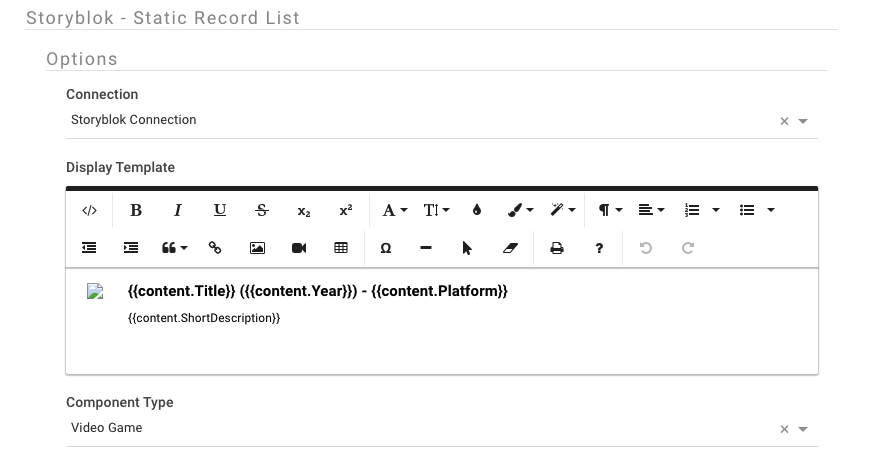
- In the Options section
- Select the corresponding connection (setup in a previous step)
- Select the content model (if a CMS)
- Select the environment and locale (if applicable)
- Define a number of records to return
- Define a Display Template (for static components)

- Hit submit to save the Component
Component Experience Rules
Components in Conscia come equipped with a unique feature known as 'Experience Rules.' These rules play a crucial role in shaping what content is presented in the component's response, allowing you to tailor the experience to your specific needs. However, before Experience Rules can be defined, a Component must first be associated with a Template, and the Template must be linked to a Channel. This structured hierarchy ensures that your experience interactions are not only efficient and consistent but also customizable to deliver the best possible user experience.
Reusability of Components
Components can be associated to one or more templates and across channels allowing them to act as a reusable element driving consistent experiences across your digital properties.
Display Templates
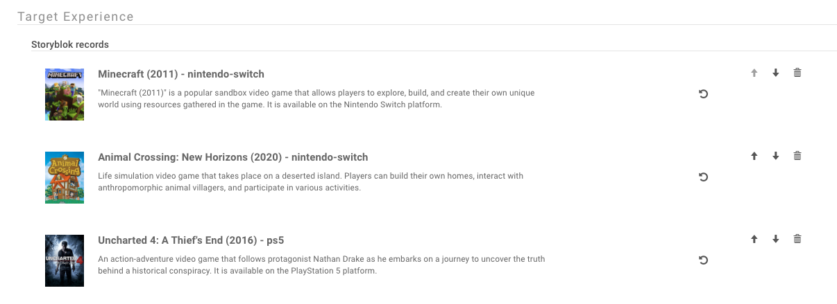
When records are displayed as part of an experience rule (or as part of a data grid in DX Graph), the look and feel of each record is controlled by the "display template". The display template is a snippet of HTML code that can contain elements of data combined with visual styling to make the record listing more visually friend to the business user.

In the example above, the display template is defined to show elements of the record including the image, name and description.
Defining a Display Template
- Navigate to the Components dashboard
- Select the experience Component of interest
- Edit the Component by selecting the update option from the right click menu.
- Under the "Options" portion of the component, find the "Display Template" section.
- Click on the code view("< >") button to bring up the HTML editor.
- Define the display template. Here, you can include HTML as well as attributes of the record using the
{{myAttribute}}syntax. - Once done, click the code view button again to visualize the record look and feel.
- Save the component

In the example above, title, description and other attributes are defined as part of the display template. The actual name of the attribute will vary based on your collections schema mode. In most cases, the field code of the attribute can be used. If your target field is a nested field in the schema, simply define the path like in the example above.
Once the display template has been defined and saved, navigate back to the corresponding experience rule to see the updated look and feel of the records.
Sample Display Template
The following display template HTML generates the layout seen in the record list above with an image to the left and name and description to the right.
<div style="display:inline;text-align:left;">
   <div style="display:inline;text-align:left;margin-right:20px;"><img src="{{Image_URL}}" height="75px" class="fr-fic fr-dii"></div>
   <div style="vertical-align:top;display:inline-block;">
      <div style="font-weight:600;font-size:1.5rem;margin-bottom:10px;">{{Name}}</div>
      <div style="font-weight:400;font-size:1.2rem;margin-bottom:10px;">{{Header}}</div>
   </div>
</div>